

Why the World Looks Different on Every Map

In 1569, Gerardus Mercator published a world map that helped sailors plot their course. His design offered a practical advantage: a route following a constant compass bearing appeared as a straight line.
Since then, cartographers have developed many other ways of depicting the world. Their aims included comparing the size of continents accurately or creating a clear world map for an atlas. The Equal Earth projection, introduced in 2018, builds on this long history.
Why World Maps Differ
A round Earth cannot be represented on a flat surface without distortion. Think of an orange peel: you cannot flatten it without tearing or stretching it.
The method used to transform the Earth’s surface into a flat image is called a map projection. Every projection preserves certain properties and changes others. This makes one map suitable for navigation and another for comparing areas.
Mercator: Plotting a Course at Sea
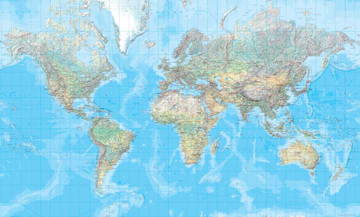
The Mercator projection has a rectangular grid with straight lines of longitude and latitude. Sailors could plot a route with a constant compass bearing as a straight line. However, that route is usually not the shortest connection between two places.
Areas become increasingly enlarged towards the poles. As a result, Greenland, Canada and Russia appear much larger relative to regions near the equator than their actual areas justify.
Mercator is valuable for navigation, but less suitable for comparing the size of continents. An adapted version, Web Mercator, is widely used for digital maps.
Mollweide: Comparing Areas

In 1805, Karl Brandan Mollweide introduced an equal-area world map. A region twice as large as another on Earth also occupies twice as much space on this map.
The Mollweide projection depicts the world within an ellipse. It is suitable for thematic maps, such as those showing vegetation zones or land use. Relative areas are preserved, but shapes change, particularly along the outer edges and near the poles.
Winkel Tripel: A Balance for the Atlas
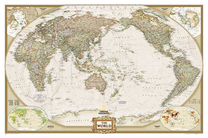
Oswald Winkel developed the Winkel Tripel projection in 1921. This map seeks a balance between distortions of shapes, areas and distances.
Its curved grid lines provide a clear overview of the world, suitable for exploring countries and oceans. National Geographic has used this projection for general world maps since 1998. However, relative areas are not preserved exactly.
Robinson: Recognisable Continents at the Heart of the Design
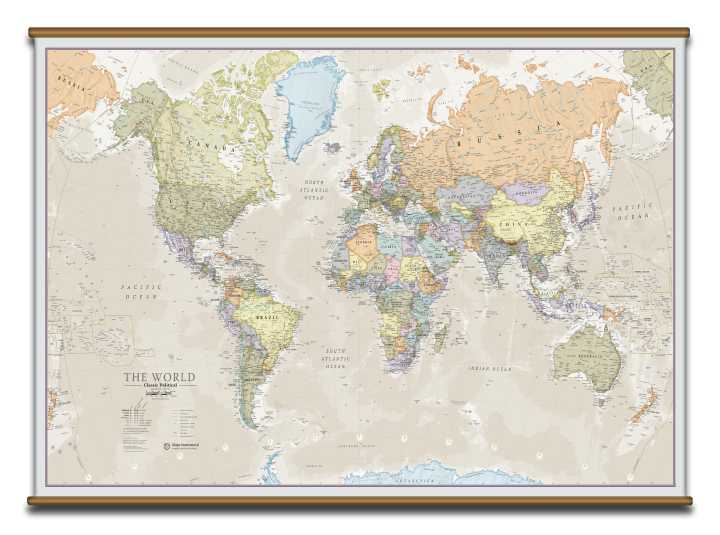
Arthur H. Robinson developed a world map for the map publisher Rand McNally in 1963. He began by shaping its visual appearance, focusing on recognisable continents and readability.
The Robinson projection has straight lines of latitude and curved outer edges. It balances different distortions to provide a useful overall view. It is less suitable for precise area comparisons: regions closer to the poles are enlarged.
Equal Earth: Accurate Areas, Recognisable Continents
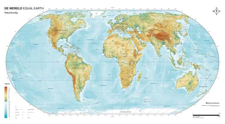
In 2018, Bojan Šavrič, Tom Patterson and Bernhard Jenny introduced the Equal Earth projection. Its appearance is similar to Robinson’s, but it preserves the true relative areas of countries and continents.
What makes an Equal Earth world map distinctive?
- Accurate relative areas: countries are not enlarged simply because they lie farther from the equator.
- Recognisable continents: their shapes change, but remain easy to recognise.
- A continuous view of the world: continents and oceans appear within a single map, without internal interruptions.
- Suitable for thematic maps: useful when the area of a region matters, such as when showing land use.
Preserving area is not new: Mollweide also has this property. Equal Earth stands out mainly through its combination of accurate relative areas and a recognisable design.
Equal Earth also distorts shapes, directions and distances. A “world map with true proportions” therefore means accurate area proportions here, rather than a completely undistorted representation of the Earth.
Which Map Suits Which Purpose?
Mercator helps with navigation. Mollweide and Equal Earth preserve relative areas. Robinson and Winkel Tripel offer a clear overall view.
No projection preserves everything at once. Looking at a world map becomes even more interesting when you ask: what was it designed for, what does it preserve, and what does it change?